Three Months with a Pen Plotter: From Burning 14 Servos to Plotting 115,000 Mona Lisas
In November 2025 I got curious about pen plotters. Three months later I have over 48 generative scripts, a 1.78 x 2.52 meter mosaic made from real people’s drawings, and the firm conviction that I will never make Christmas cards by hand again. This is the story.
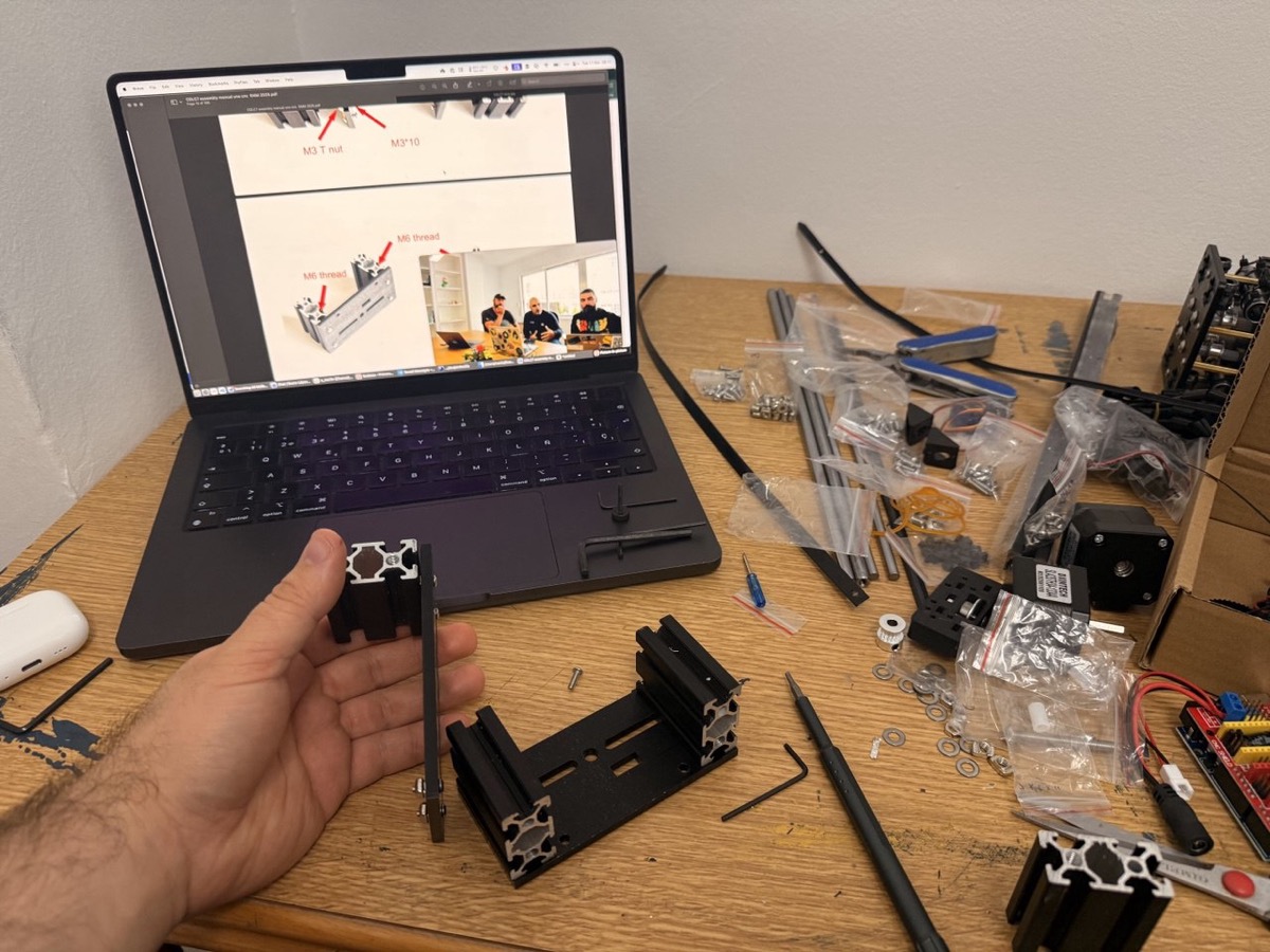
The beginning: a 100 euro plotter and 14 burnt servos
Pen plotting had been on my radar for a while, but I never got around to it. In November 2025 I finally went for it and put together a low-cost CoreXY plotter for about 100 euros. No endstops, manual homing, pen control via a servo, USB serial connection. The whole thing held together with optimism and YouTube tutorials.
The result? Surprisingly accurate for the price. The real cost? 14 burnt servos. All learning, all the time.
But it confirmed the important thing: I was hooked.
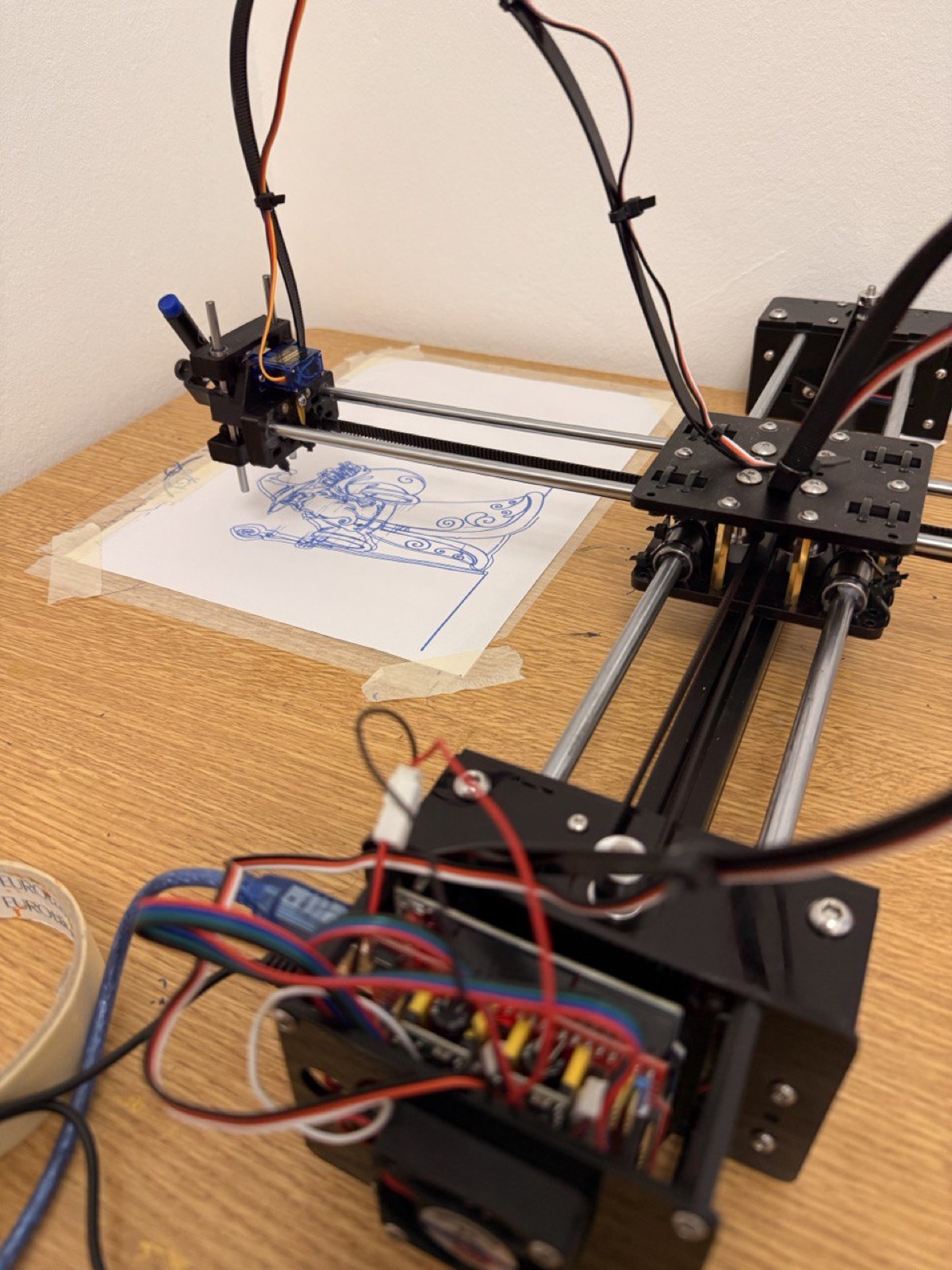
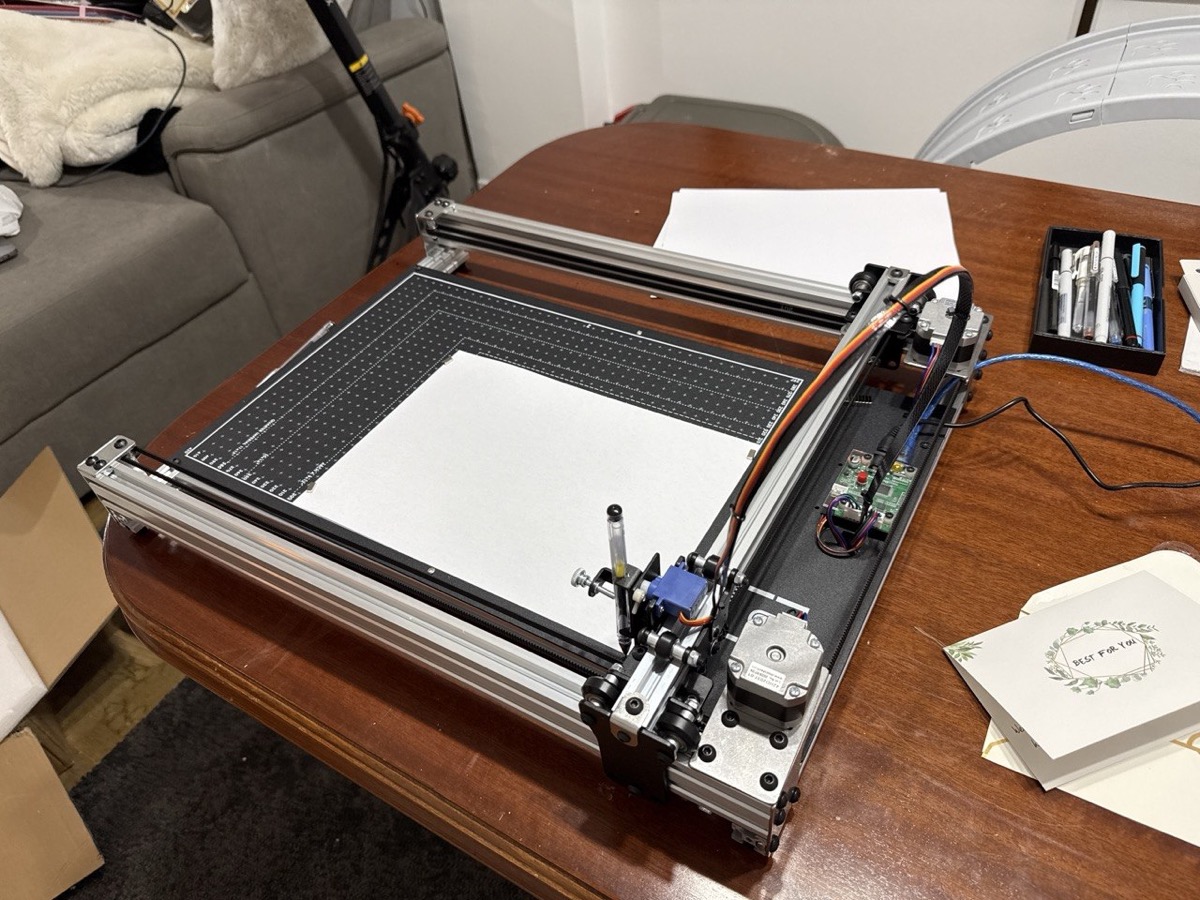
The upgrade: iDraw H SE A3
Once the addiction was confirmed, I put in a bit more money and got an iDraw H SE A3, an AxiDraw-compatible plotter with a full A3 working area. Night and day difference: better linear guides, better use of space, and a proper software ecosystem.
The plotter is controlled by a Raspberry Pi Zero 2 W running Saxi, a web interface that takes SVGs directly. I generate an SVG with Python, optimize it with vpype (reordering strokes to minimize pen-up travel), and send it to Saxi from my browser. For special cases I also wrote a direct control mode that bypasses Saxi entirely and streams low-level EBB commands to the plotter over SSH through a Node.js script on the Pi.
Procedural art: when code draws
I’ve spent most of my time on generative art, drawings made purely with code. I’ve written over 48 generator scripts in Python, all following the same pattern: generate coordinates, scale to page size, export SVG with svgwrite. Each script prints the total stroke length and estimated plot time.
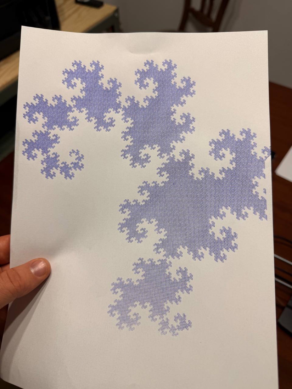
Fractal curves
Fractals are a pen plotting classic, and for good reason. The curves that emerge from simple rules are hypnotic when you watch them being drawn with a ballpoint pen. I implemented a decent collection:
- Dragon Curve: the iterative “paper folding” construction. Each iteration doubles the segments. At 16 iterations that’s 65,536 line segments emerging from a ridiculously simple rule (at each step: previous sequence + right turn + reverse of previous sequence).
- Hilbert, Peano, Moore, Z-order: space-filling curves, each with its own personality.
- Gosper (snowflake curve): an L-system with 60-degree turns.
- Sierpinski, Levy, H-tree, Osgood: more fractal variations.
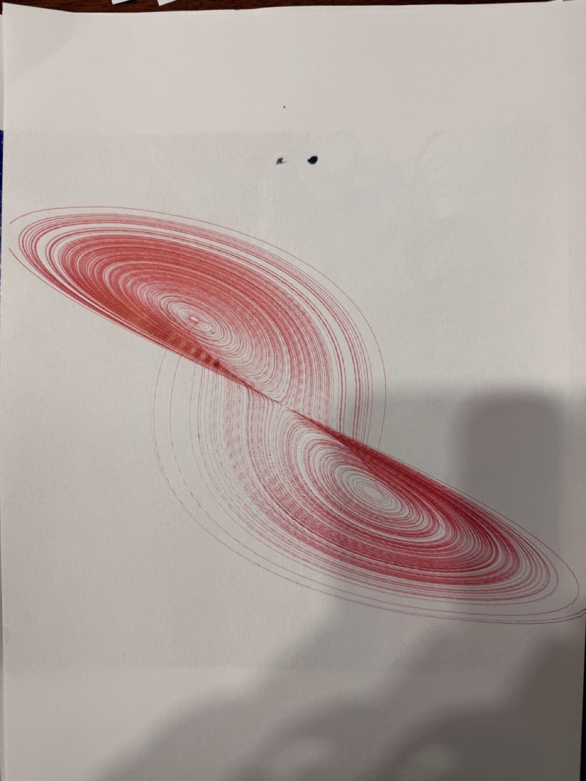
Strange attractors
These were some of my favorites. Chaotic differential equations that somehow produce elegant curves, drawn out slowly with a ballpoint pen. Hard to look away.
They all use scipy’s Runge-Kutta integration with tight tolerances to get smooth, precise trajectories. Euler integration just doesn’t cut it here:
- Lorenz: the classic butterfly. I made multiple variants with different parameters and projections, each one looks completely different.
- Aizawa: a toroidal structure with chaotic dynamics. Looks great from any angle.
- Halvorsen: triple rotational symmetry, the three 2D projections are practically identical.
- Thomas, Dadras, Sprott B: more variants, each with its own character.
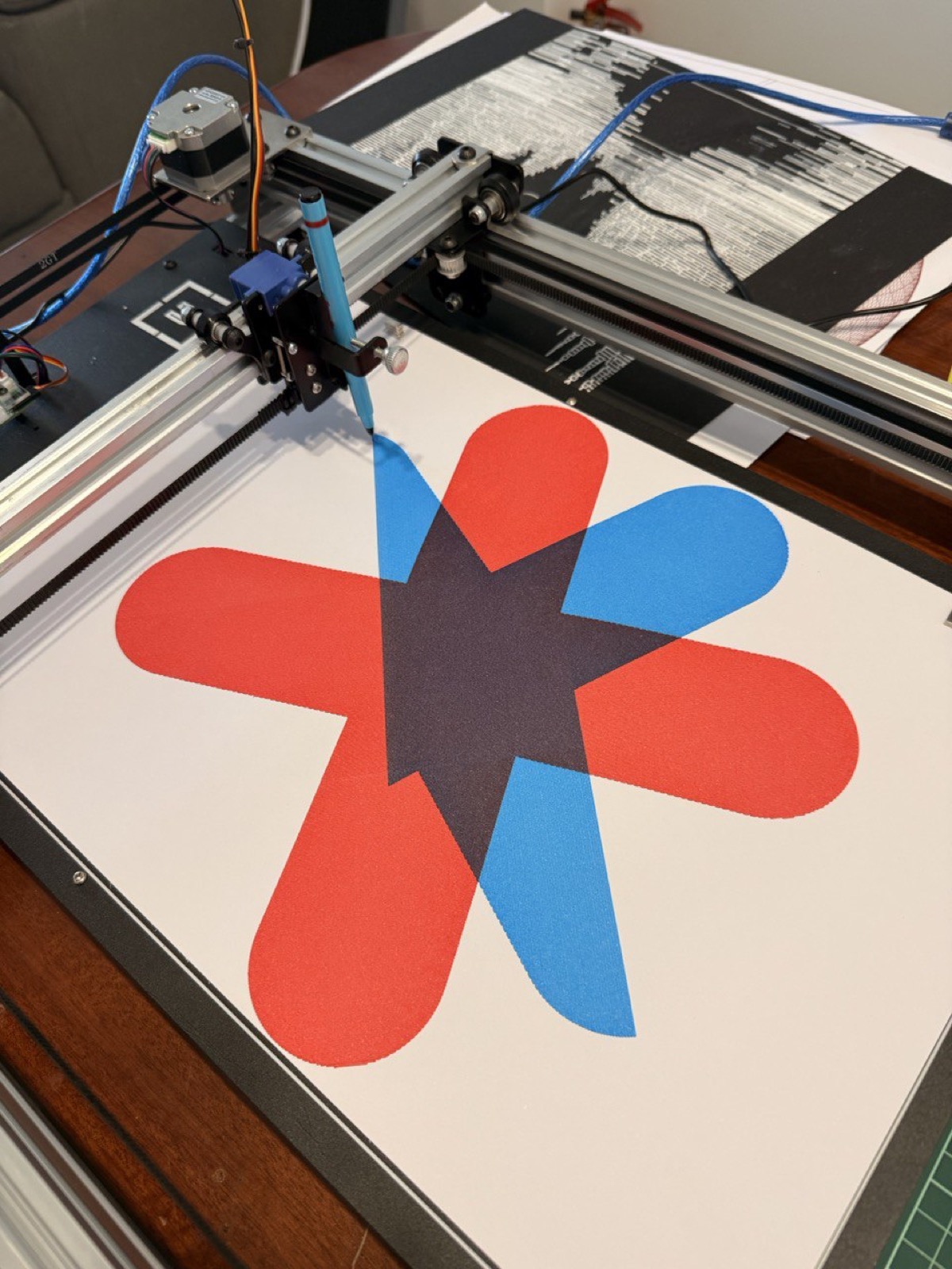
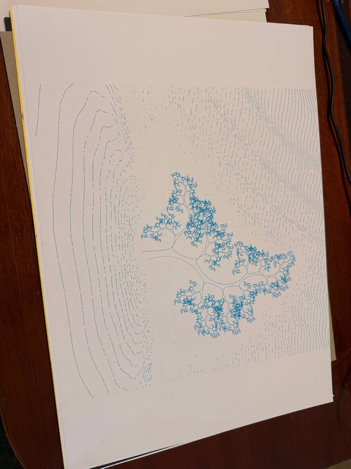
Flow fields
Inspired by Tyler Hobbs: curves that follow a vector field generated with OpenSimplex noise in 3D. Each curve advances step by step following the local angle, with a minimum separation check to avoid overlaps.
The best part is that by varying a z-offset parameter I can generate 4 independent layers (one per color), so the same composition can be plotted with multiple pens for a multicolor result.
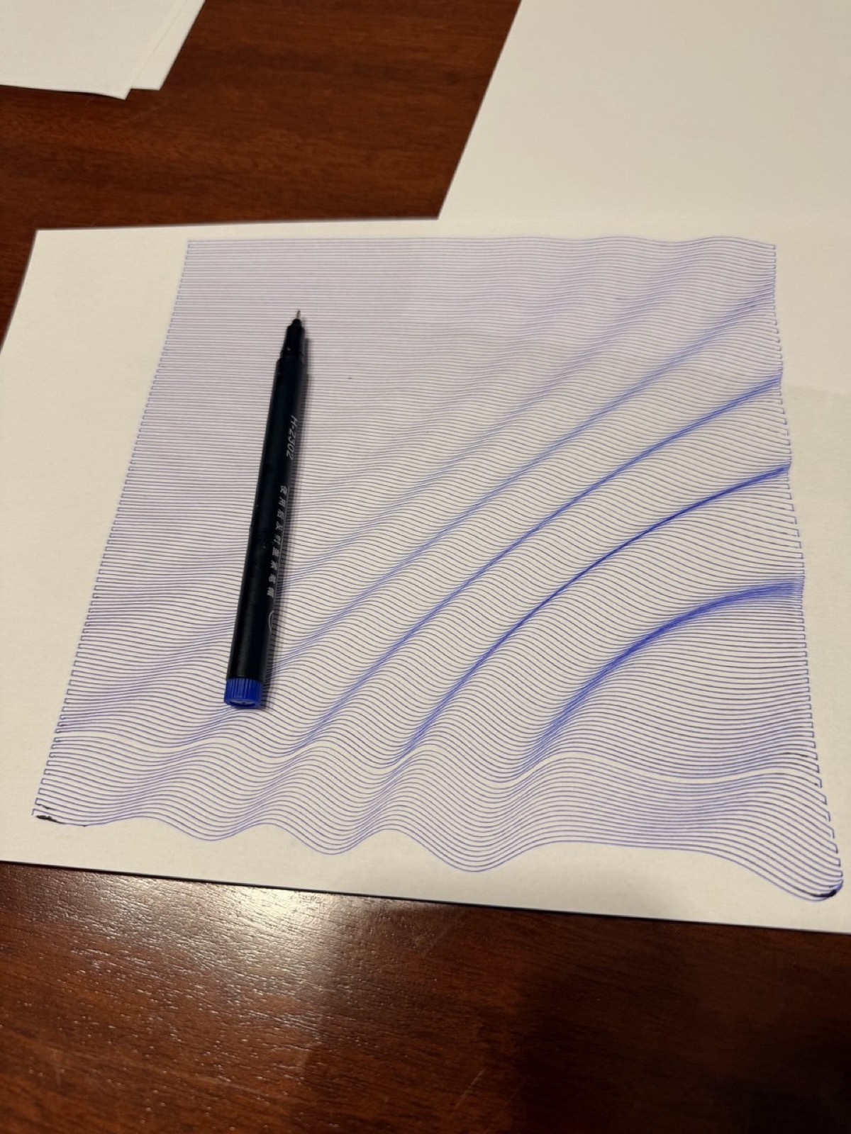
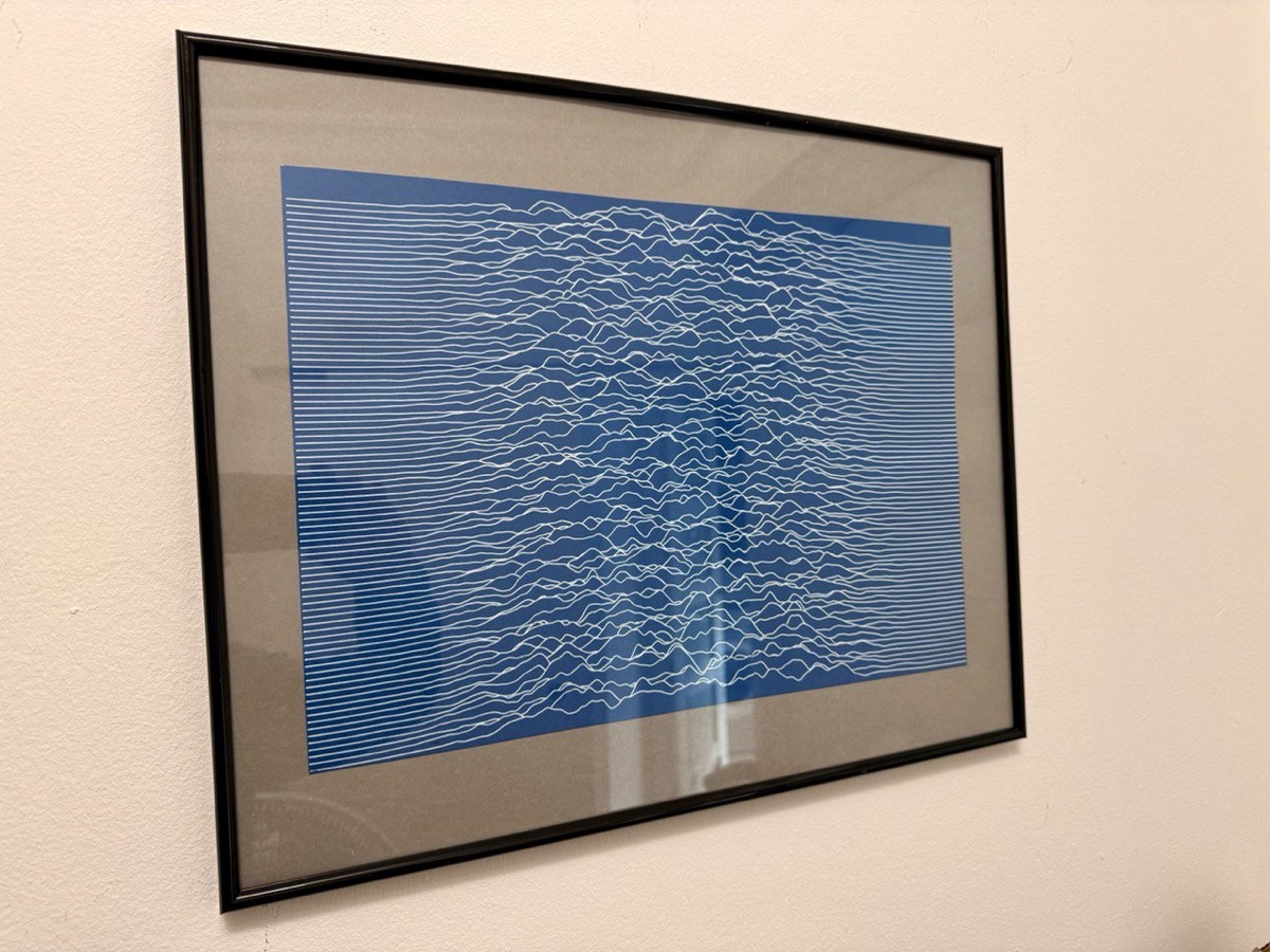
Joy Division waves
A take on Joy Division’s “Unknown Pleasures” cover: stacked horizontal lines with noise-modulated amplitude and a horizon tracking system that hides segments behind the crests. That’s what gives it the depth. This one ended up framed on my wall.
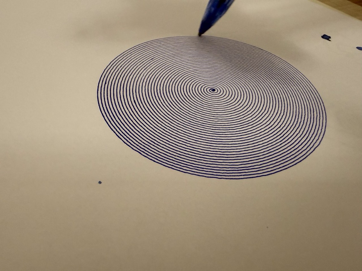
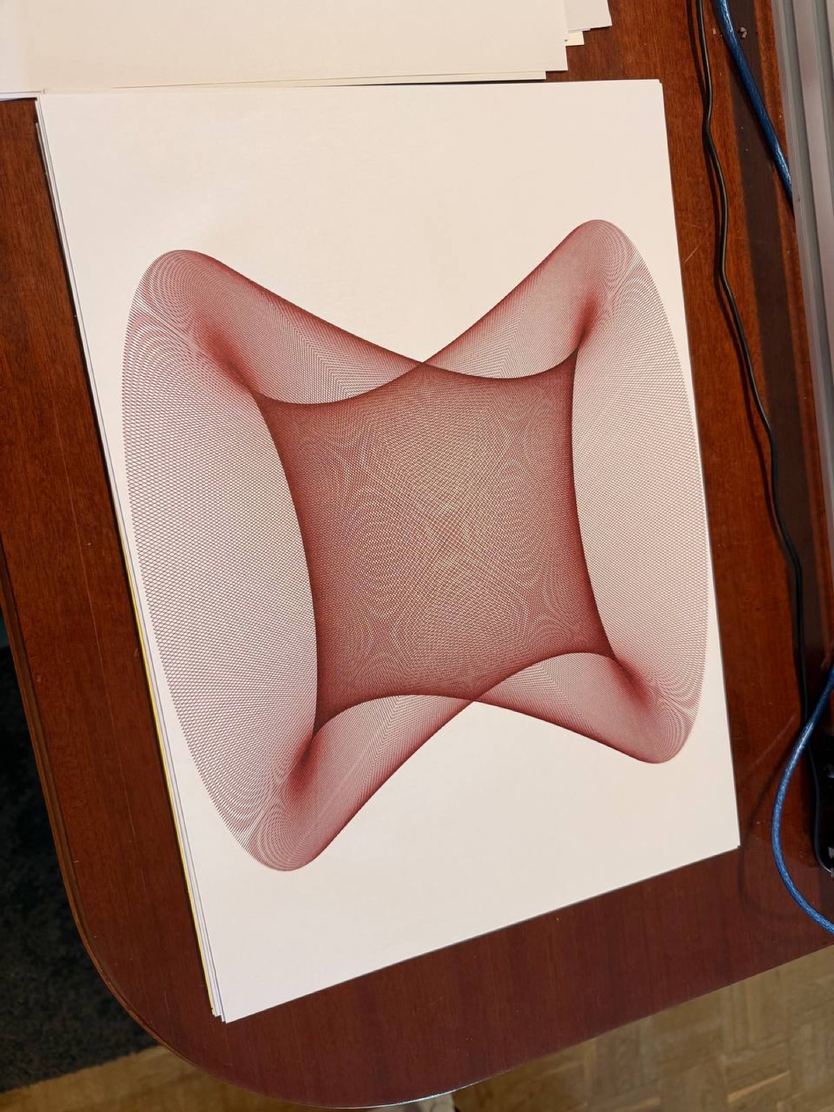
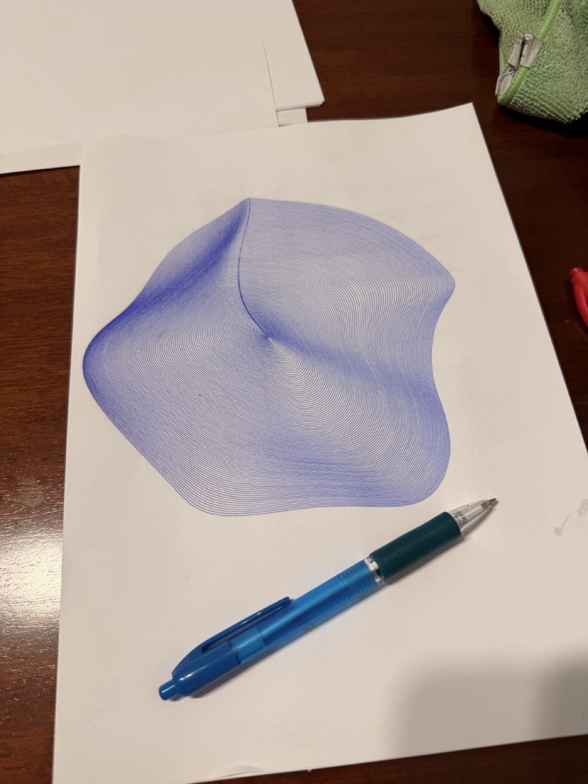
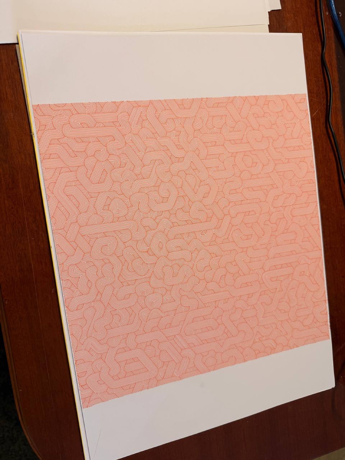
Guilloches
Security patterns inspired by the ones on banknotes: circular, elliptical, linear, and combined. The overlapping curves look great and are oddly satisfying to watch being plotted.
And more…
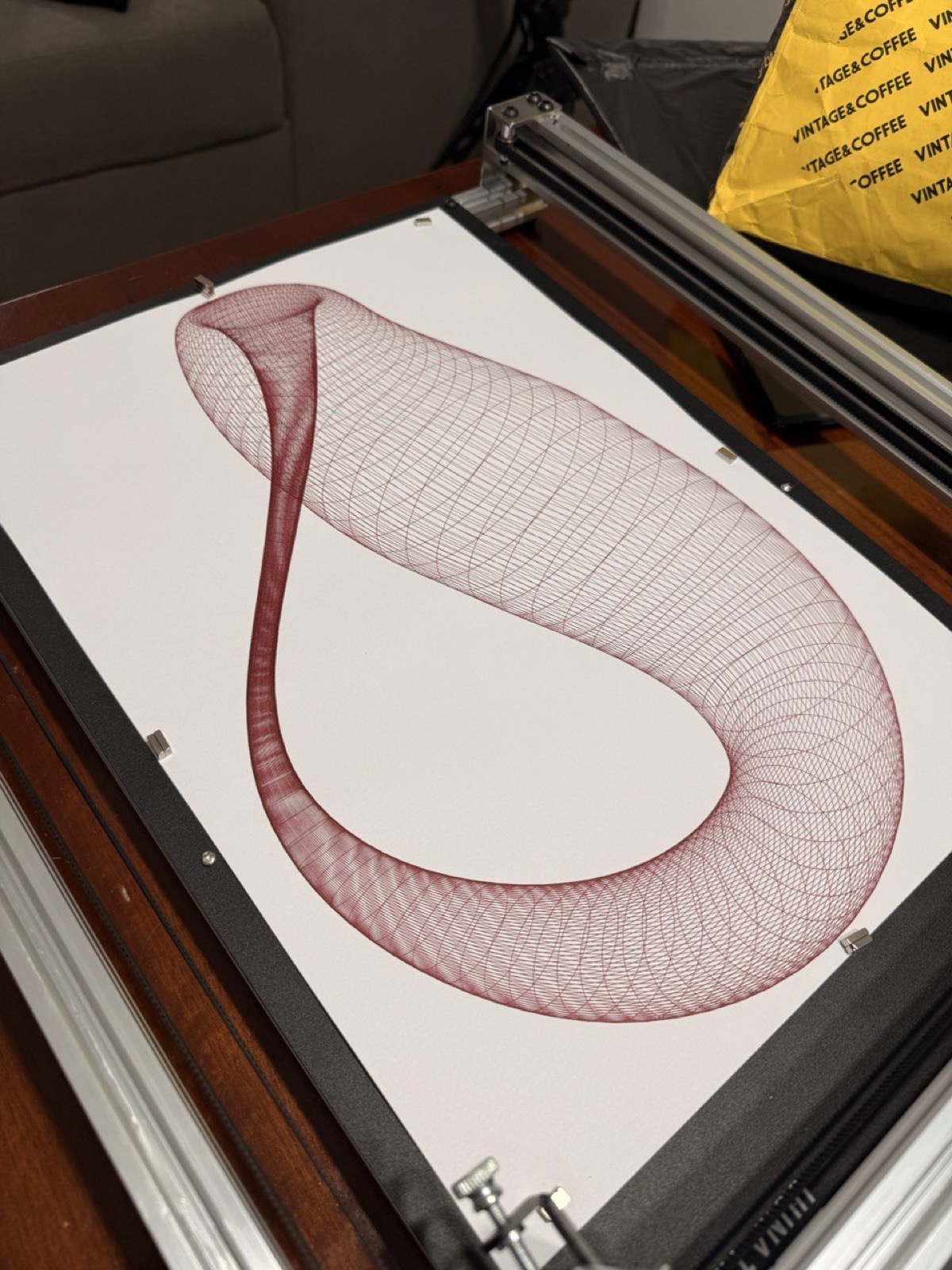
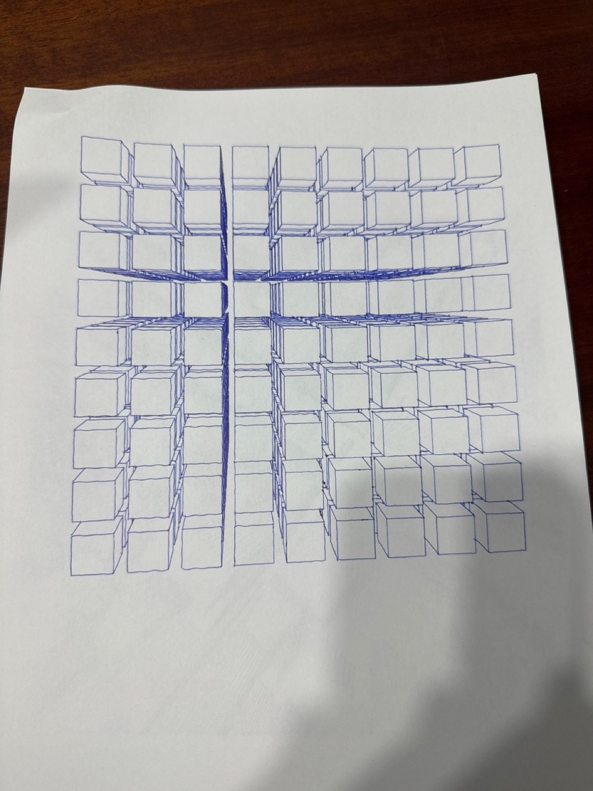
Fermat spirals, phyllotaxis, hypotrochoids, logarithmic spirals, Cornu curves, differential growth (biological growth simulation with repulsion forces and Laplacian smoothing), 3D shapes with isometric projection and hidden line detection…
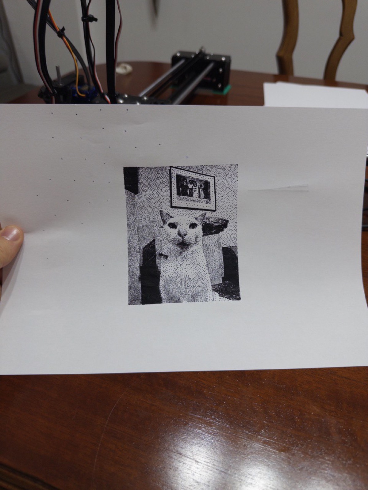
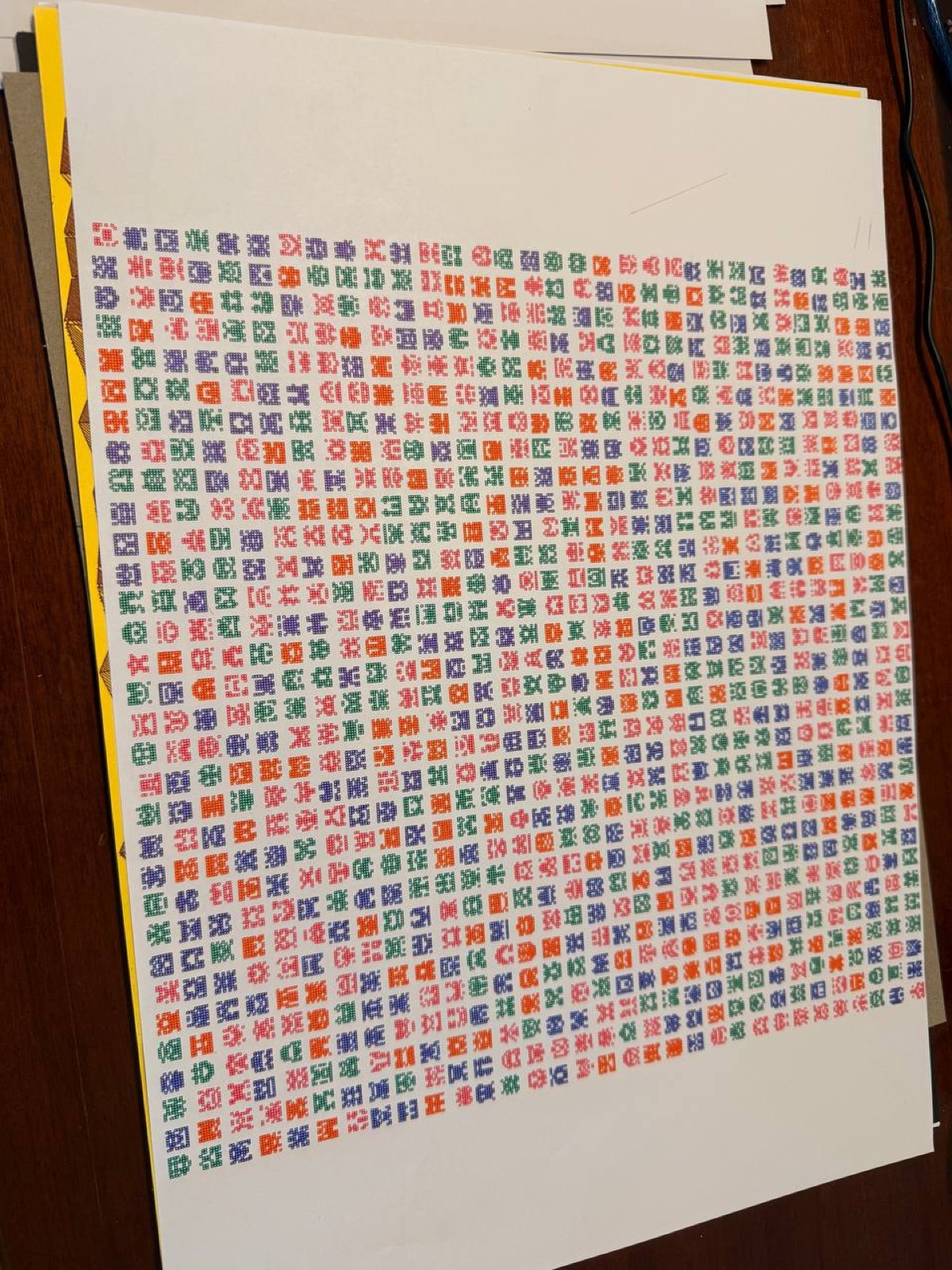
Raster to vector: harder than it looks
One of the things I explored was converting rasterized images to vector strokes for plotting. It’s not trivial at all. I experimented with different techniques:
- Stippling: representing tones with dot density.
- Single line: one continuous line that modulates its path to create the image.
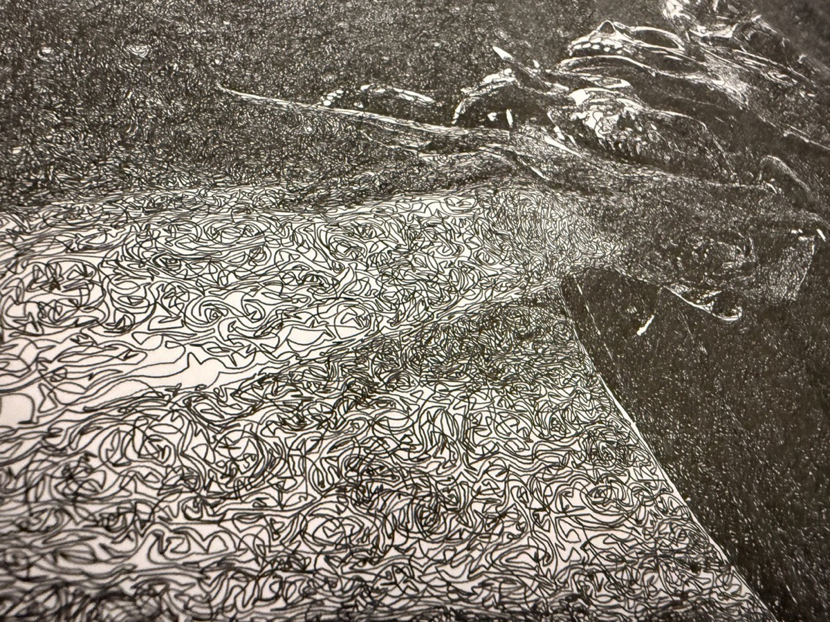
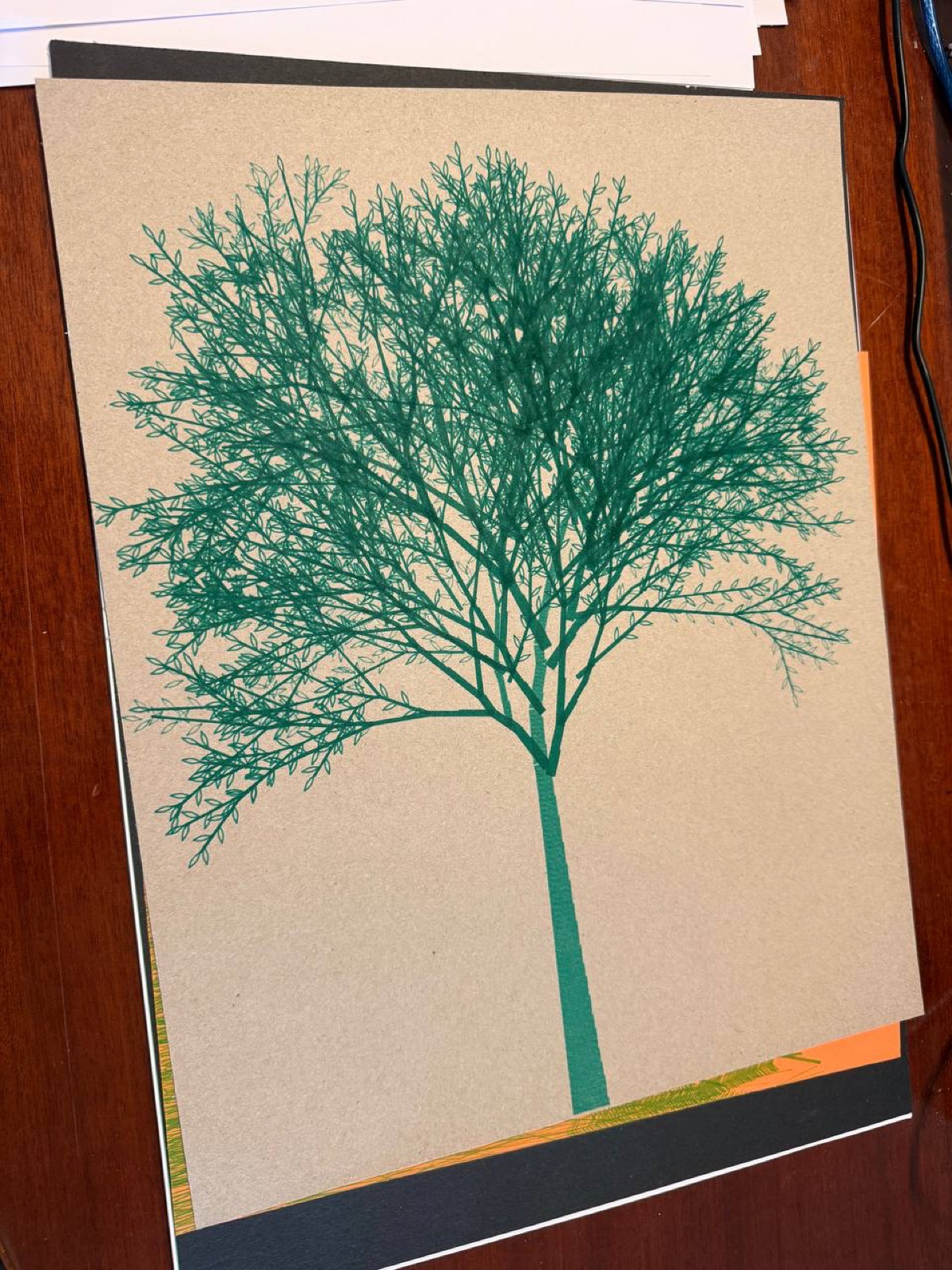
- Cross-hatching: filling areas with crossed strokes to create volume. I used this one a lot. The algorithm rotates the polygon, generates parallel lines, clips them with Shapely, and rotates back. Applied it to logos, portraits, you name it.
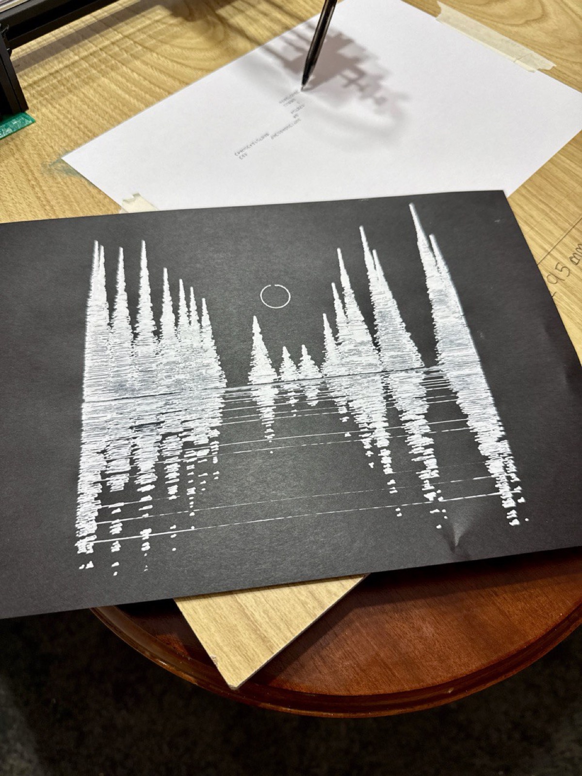
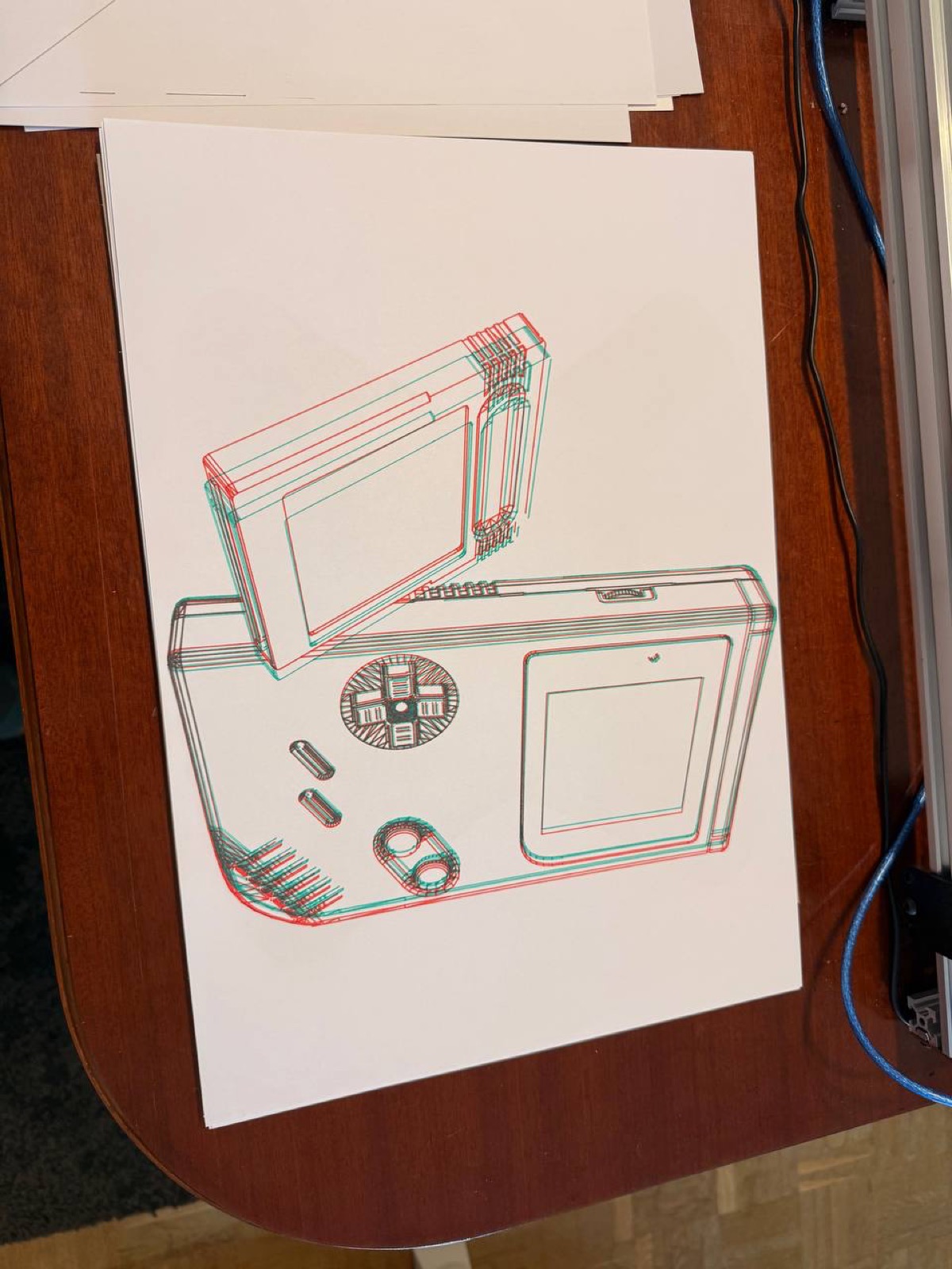
I also pushed the plotter to its limits testing different writing tools: fine-tip pens, thick markers, gel pens on black paper… each one gives a completely different result.
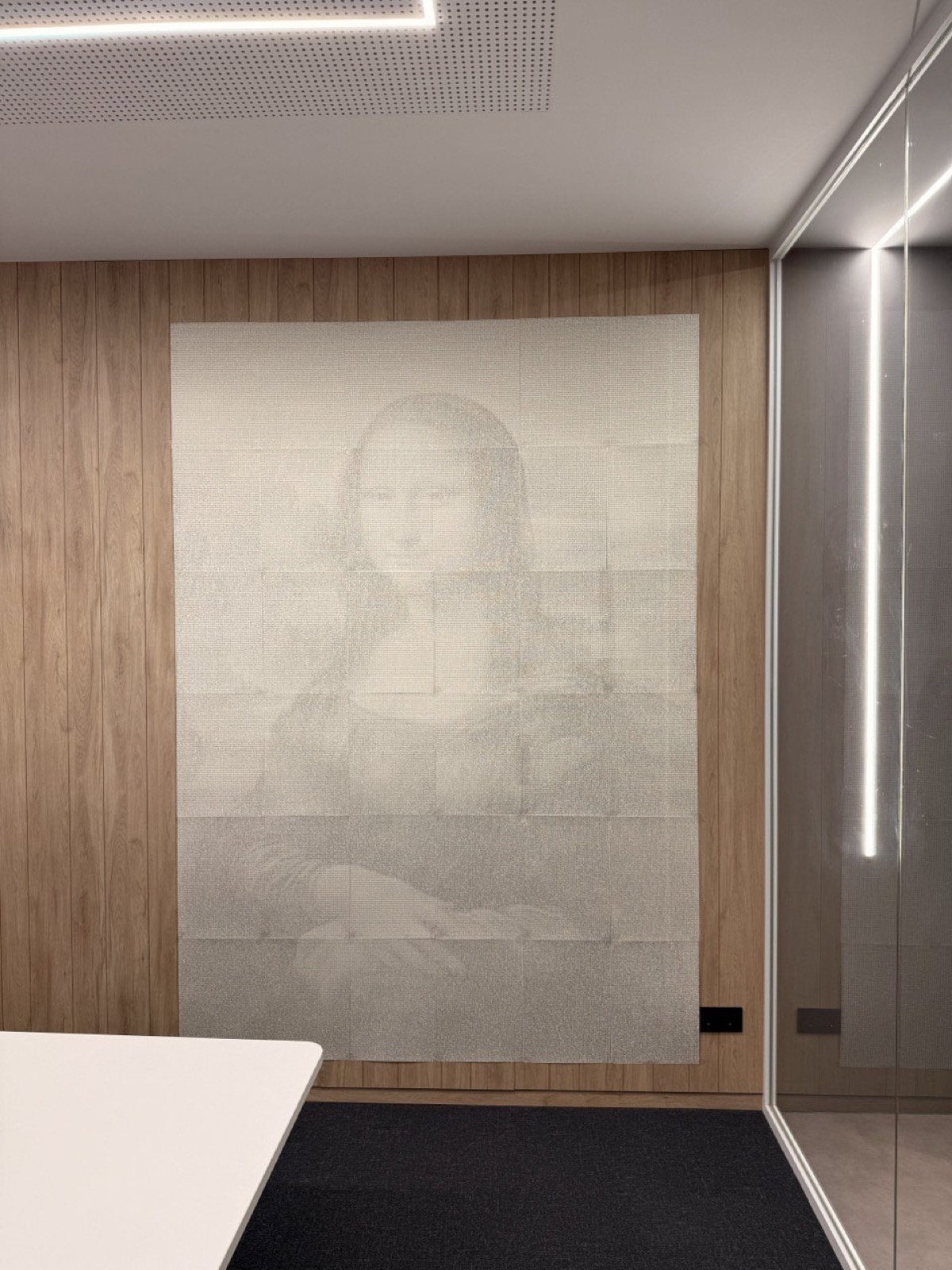
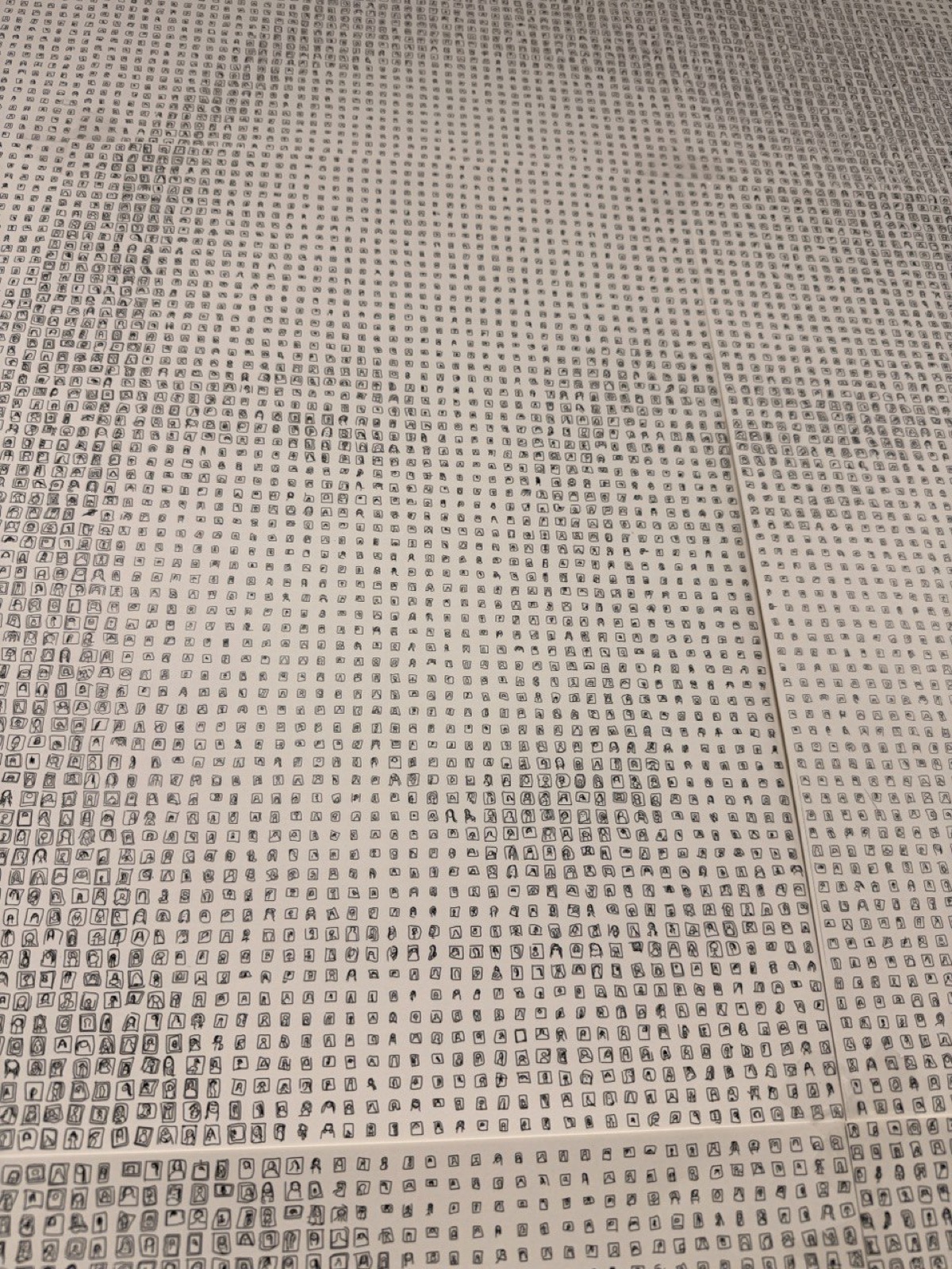
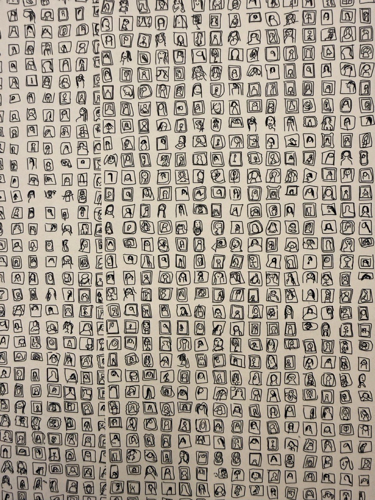
The big project: 115,000 Mona Lisas
This was the big one. The idea: use the Google Quick, Draw! Dataset, a database of 50 million drawings made by real people in 20 seconds, to compose a giant Mona Lisa made of Mona Lisas.
The dataset
Google Quick, Draw! is a game where you’re asked “draw X” and you have 20 seconds to do it while a machine learning model tries to guess what you’re drawing. The dataset has 345 categories. I used the “The Mona Lisa” category: thousands of interpretations from people all over the world trying to draw the Gioconda in 20 seconds. Some are surprisingly good. Others are… art.
The technique
The algorithm is a photomosaic, but with drawings:
- Take a reference image of the Mona Lisa in grayscale.
- Divide it into a grid (about 50 columns).
- Classify the dataset drawings by stroke density (total line length) into 16 buckets. The “densest” ones represent the dark areas, the “lightest” the bright areas.
- For each grid cell, check the brightness of the corresponding pixel, pick a drawing from the appropriate bucket, and scale it according to darkness (between 0.3x and 0.95x of cell size).
The scale
- 36 A3 sheets (6 columns x 6 rows), no margins between sheets so they tile seamlessly.
- 104,544 individual Mona Lisas drawn with a ballpoint pen.
- Final size: 1.78 x 2.52 meters.
- Plot time: 2-3 weeks with the plotter running on and off.
From a distance, you see the Mona Lisa. Up close, you see thousands of doodles from people all over the world trying to draw her. I love that duality.
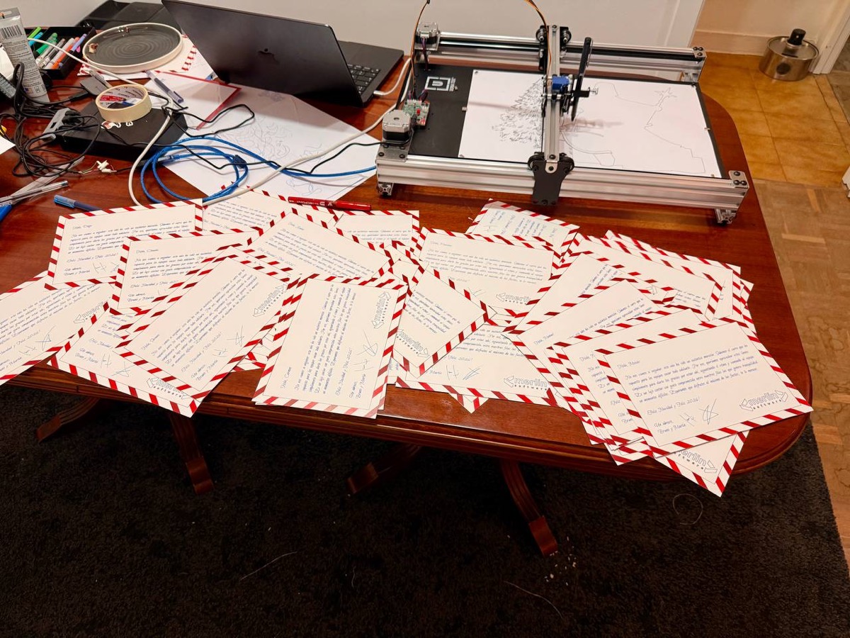
Christmas cards: never again
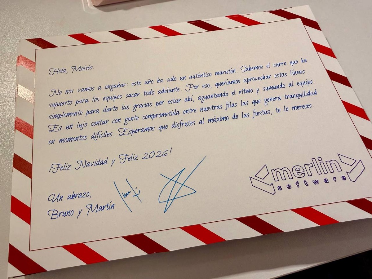
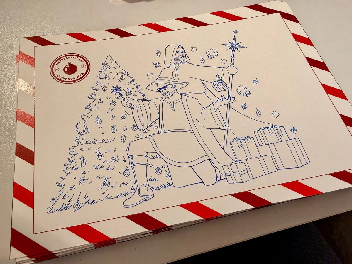
The other big project was making personalized Christmas cards for every employee at the company. The idea sounded great: a holiday greeting drawn by a pen plotter, with artwork by a vector artist (no AI involved), and each person’s name in a plottable calligraphic font.
Each card had a personalized letter using EMSBirdSwashCaps, a single-stroke typeface where the pen follows the actual letter shape instead of tracing outlines. The text auto-sized with binary search to fit on A5, with proper Spanish hyphenation. I generated over 54 individual cards, combined them 4 at a time on A3 sheets with positions calibrated to the millimeter, and plotted them. Another script handled the reverse sides with the company’s wizard illustration.
Then came weeks of plotting. Then cutting the cardstock by hand. Aligning front and back. Signing each one individually.
Never again. It was way too much work. But the look on people’s faces when they received them… well, almost worth it.
The toolkit
For the curious, here’s the tech stack:
| Tool | Use |
|---|---|
| Python + svgwrite | SVG generation |
| vpype | Stroke optimization (linemerge, linesort) |
| numpy / scipy | Math, ODE integration |
| Shapely | Geometric operations, clipping, occlusion |
| svgelements | Parsing existing SVGs |
| opensimplex | Noise for flow fields |
| Saxi | Plotter control via web |
All scripts follow the same pattern: argparse for CLI, svgwrite for the SVG (with viewBox in millimeters), and at the end they print the total stroke length and estimated plot time at 50 mm/s. Simple, reproducible, tweakable.
What’s next?
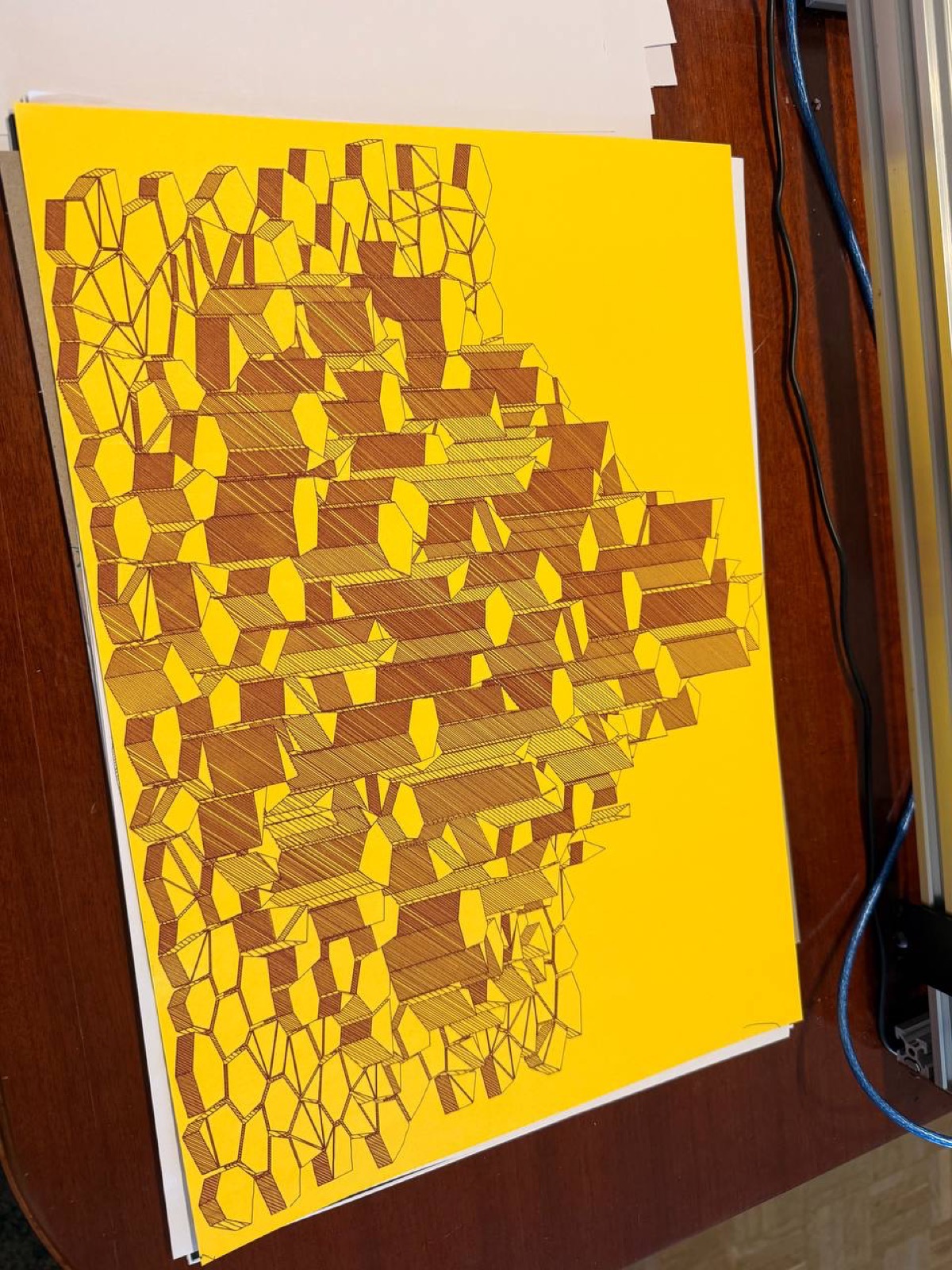
The latest experiment is an isometric renderer for Minecraft worlds. It loads real Minecraft saves, generates procedural textures, projects everything in isometric, and applies level-of-detail so the resulting SVG doesn’t explode in size. Still rough, but promising.
Three months, over 48 scripts, hundreds of A3 sheets, and the ideas keep coming. Pen plotting does that to you. It’s code, math, and the simple pleasure of watching a pen move across paper. Turns out that combination is hard to put down.
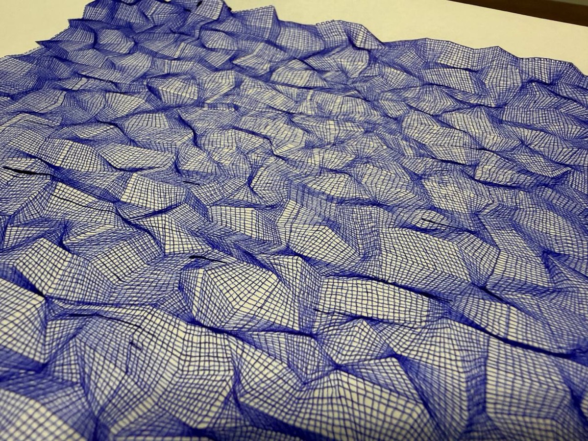
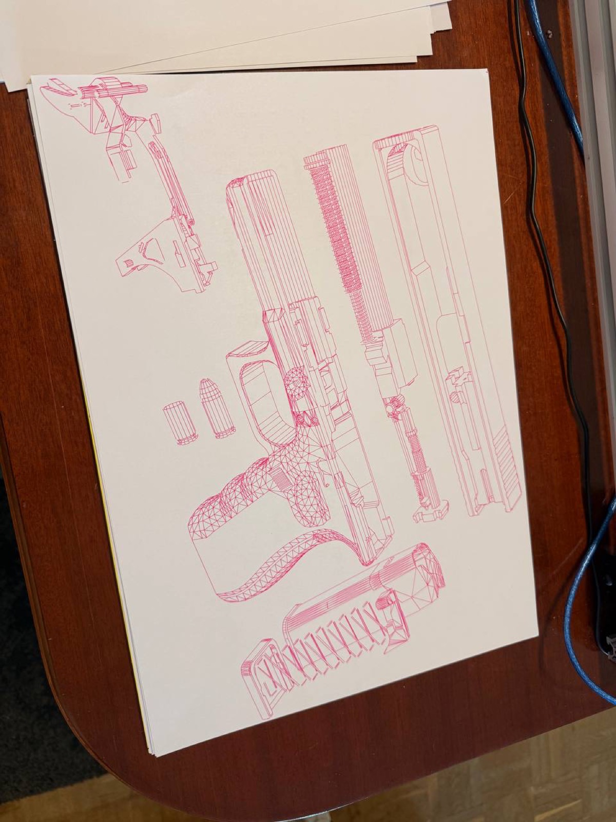
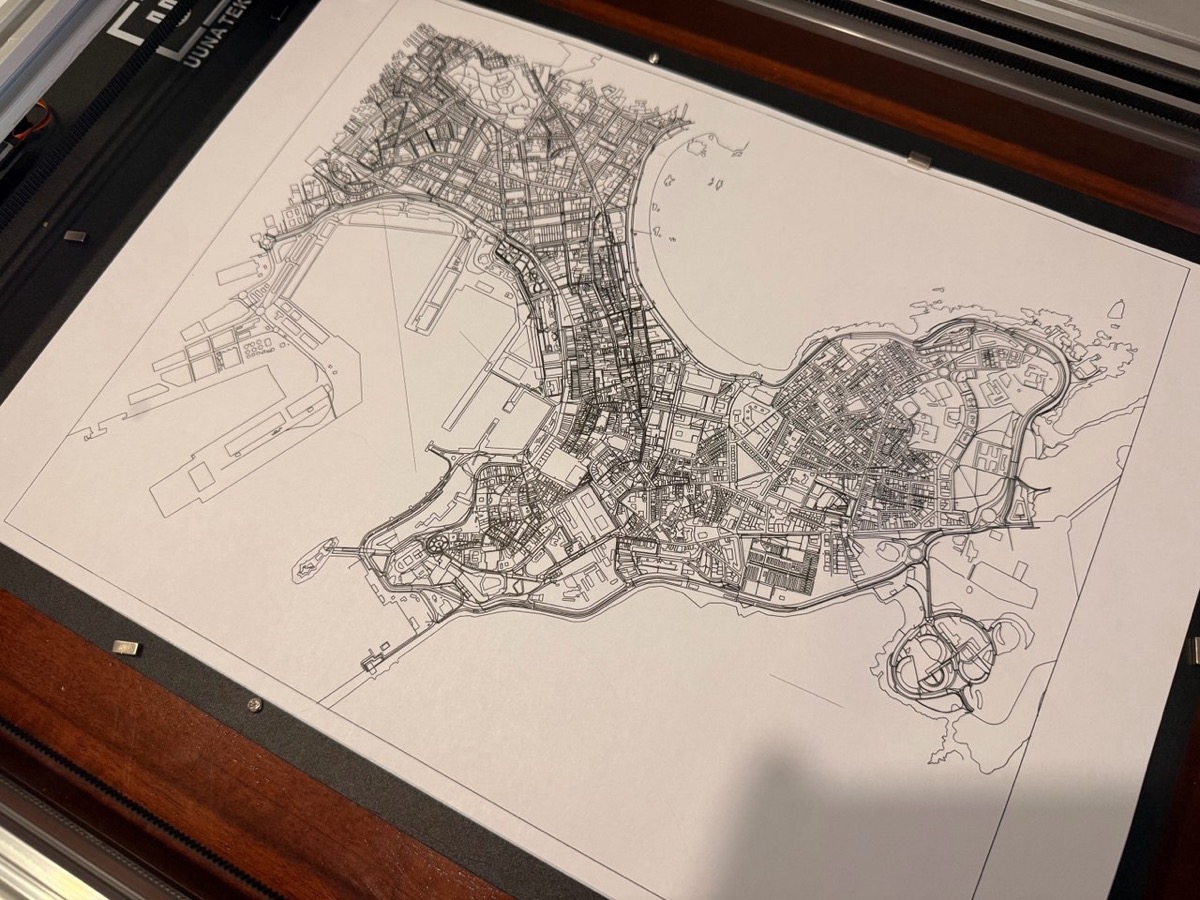
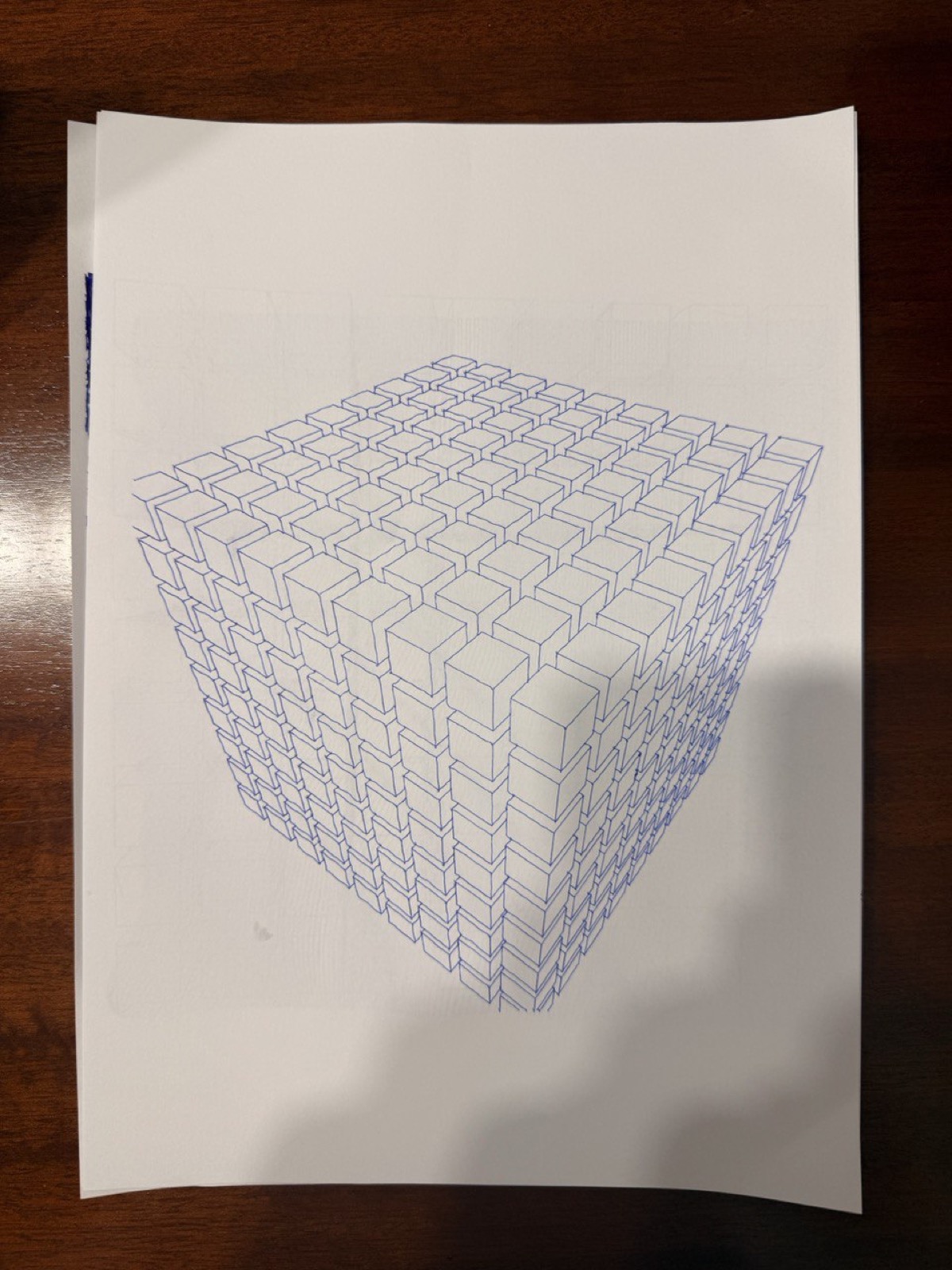
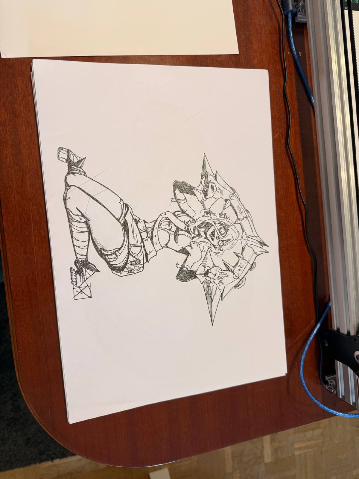
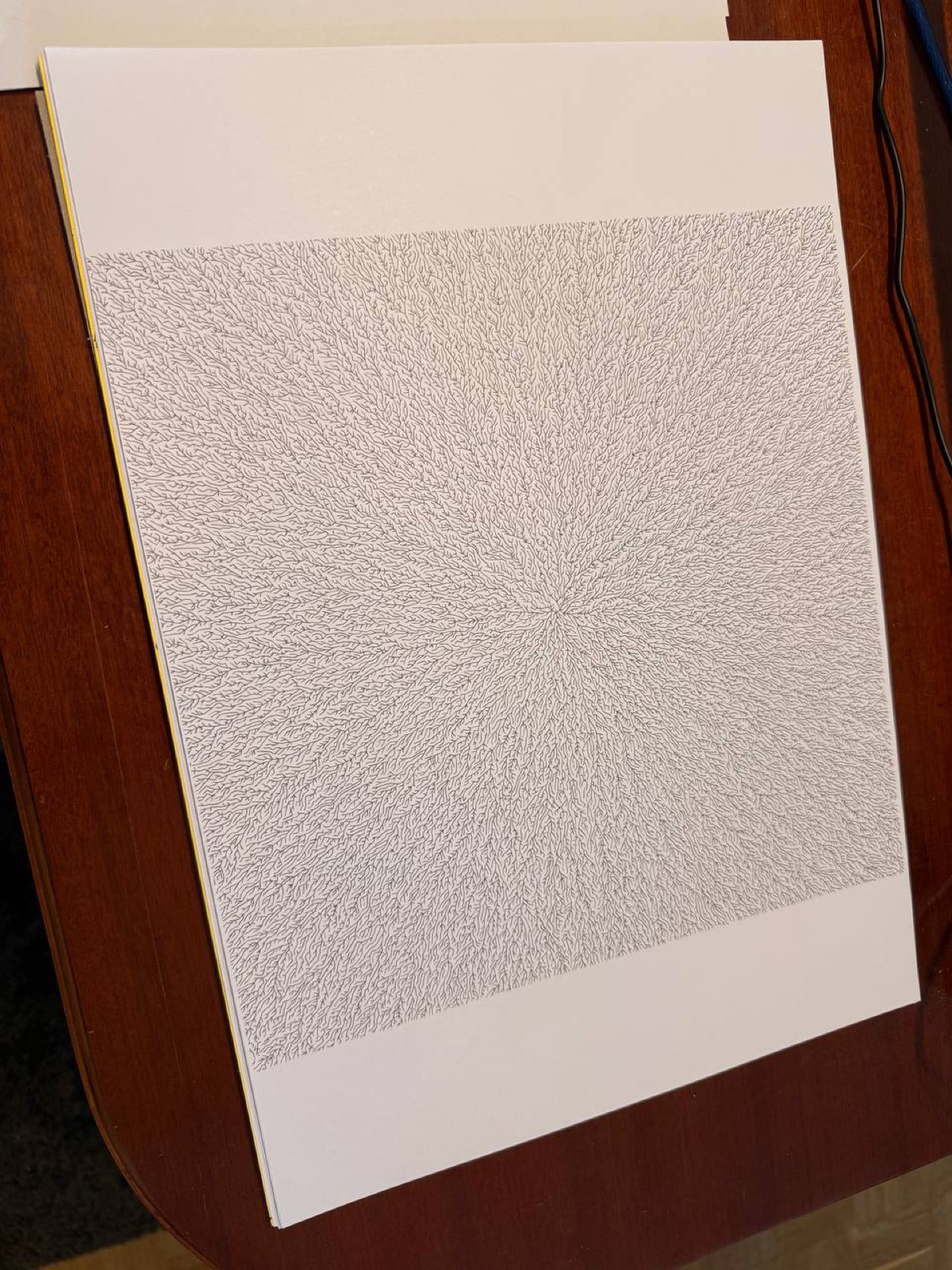
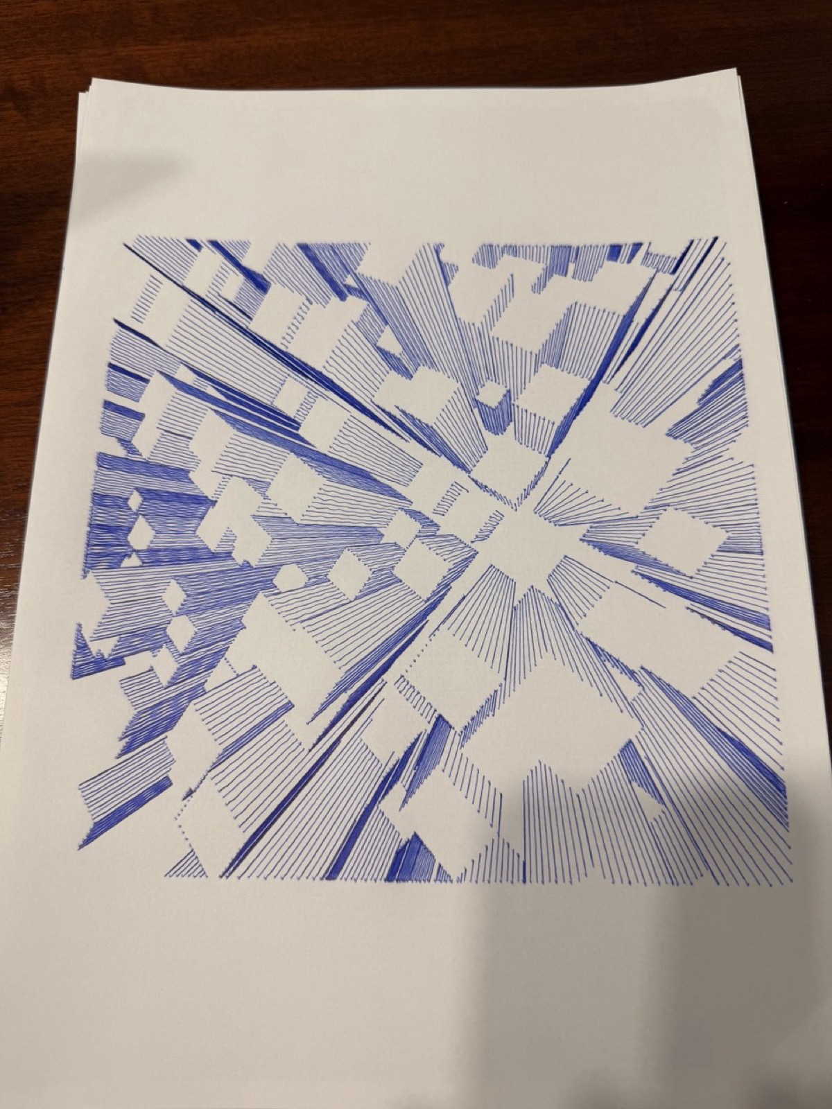
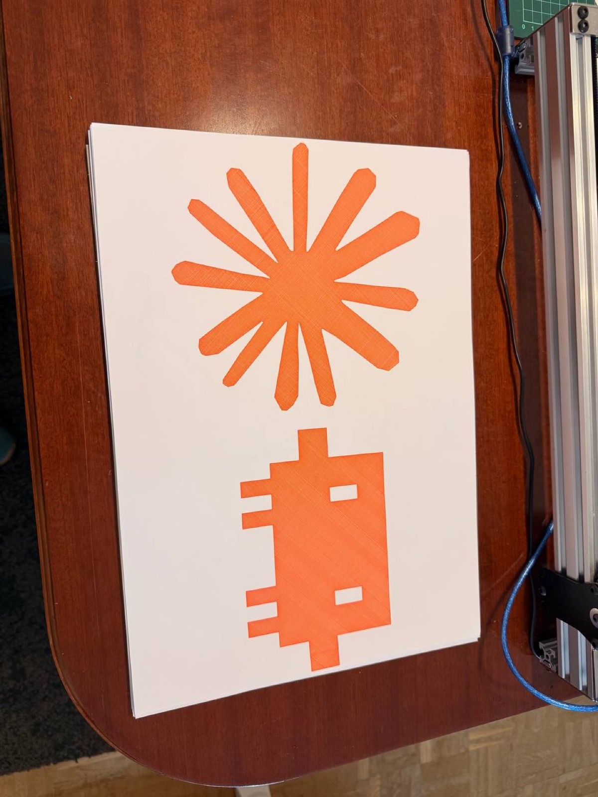
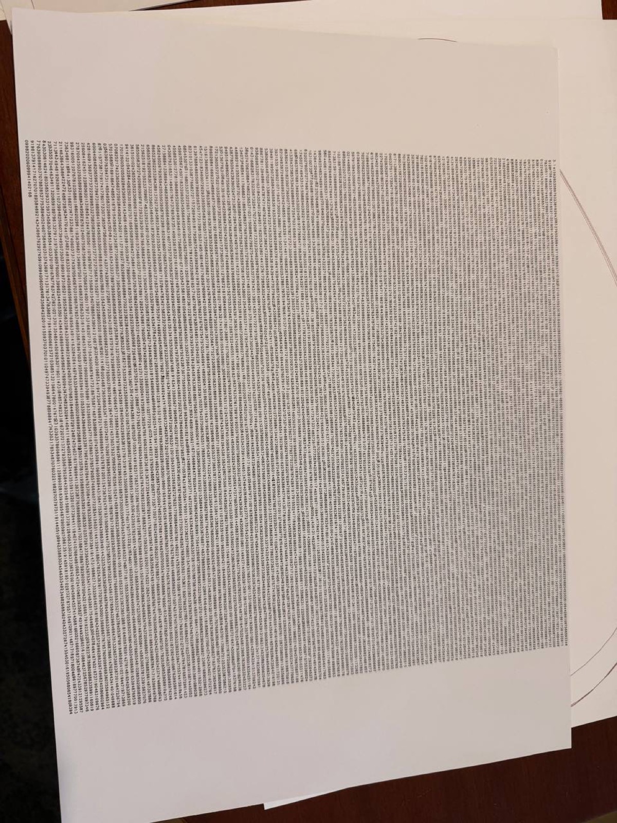
Gallery
Some more plots from the last three months.
All code is written in Python. The plotter is an iDraw H SE A3 controlled by a Raspberry Pi Zero 2 W running Saxi.